Today, designers know that what their customers are wearing is almost instantaneously translated into the rooms they’ll be wearing them in.
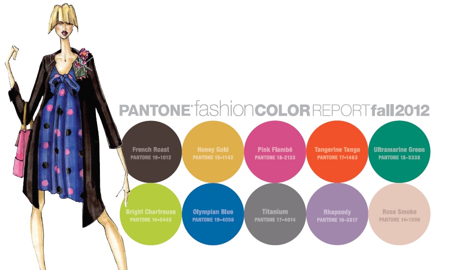
So here’s Pantone’s Fall 2012 Fashion Report that definitely forecasts our interiors color palettes. Love potions, the magical hour of sunset; witches and warlocks, fantasy and illusion are all inspiring designers this fall. With an unexpected mix of darks, brights and neutrals, this palette not only has something for everyone, but can transport consumers to an enchanting place, free from the stresses of everyday life.

Transitioning into the season, Bright Chartreuse, a vital yellow-green, pays homage to a typical spring shade and creates a bridge as a perfect accent into fall.
Pink Flambé is a delicious, vibrant pink with a bit of heat to it and as we mentioned we saw in all the halls and showrooms at M&O and Paris Deco Off.

Pair it with tantalizing Tangerine Tango( 2012’s color of the year) for a retro feeling.

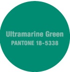
To calm things down, combine these vibrant warm tones with Ultramarine Green, a deep, cooling blue-green.
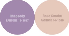
Rhapsody is an ethereal grayed-down purple that also encourages comfort and serenity with its quiet, muted tone.
Honey Gold, a mellow, burnished yellow, suggests the soft dappled light of Fall. Pair it with Olympian Blue.

Olympian Blue, a patriotic blue that will surely make its way into athletic apparel and also referenced nautical looks for interiors.
French Roast is a sophisticated hue that is a great alternative to the black and charcoal basics.

Other staple neutrals include elegant and versatile Titanium, the quintessential cool gray, and Rose Smoke, a veiled rose tone that pairs well with Rhapsody and Titanium.


