MoOD – Meet only Original Designs – is the international trade fair for upholstery, window and wall coverings and the only market in the world to feature producers who fully own their collections. Held every September in Brussels for three days, it focuses on textile innovation and trend.
Niek De Prest, MoOD art director and his trend board share this year’s directional theme- Fluxus.
Fluxus Even change is changing
Fluxus literally means ‘pure flow’. It is also the name of an art movement from the sixties which marked an important transition period and left an ineradicable mark on the rest of the 20th century. Many artists who attract renewed attention today were part of that Fluxus movement: Stanley Brouwn, Joseph Beuys, On Kawara, Yoko Ono, Georges Maciunas. While the search for a new balance in the sixties was settled by consumerism, today questions are put forward about the end of the economic growth.
The MoOD trend board named the directional theme Fluxus because of its resemblance to our current times. Like the sixties we stand on the verge of big and essential changes. The “purifying flow” literally flushes the old economic mind-set and signals change in the textile landscape. We currently find ourselves in a transitional space which will determine the future of the textile industry. Our entrepreneurs will have to face an enormous challenges , but challenges filled with opportunity.
The trend FLUXUS explores three inspiring future scenarios:

1. TRANSITION
The transition in which we find ourselves is marked by an abundance of styles that overlap and converge as we look to the future and the back to the past. Transition is woolly, soft colored and searching.
Hipsters play a huge role in this trend direction. They are focused on durability and use goods economically. Their food is organic and they cherish materials with a story. Their natural interiors are reminiscent of the hippies of 60’s. They are searching for a new balance between nature and humanity but are also inspired by high tech. Transition is about honest materials, unconstrained natural style, a personal approach and optimistic use of colors are at its heart.

The color palette:
The soft palette of TRANSITION is ‘on the move’. It floats right past you. Natural and effortless as new clouds. It flirts with nature; it transports you to a new place. Or maybe it keeps waiting patiently. The colors are out in front, but also bring up the rear. Playing with the light that softens them, like a misty transition in space.
Green and blue are the base colors; they do not only support the relationship with nature, but also with the entire palette. Bleached orange, soft purple, and pink or milk white and white. Combined with natural linen hues or with a shadow of gray, the pastels are brought into another dimension.

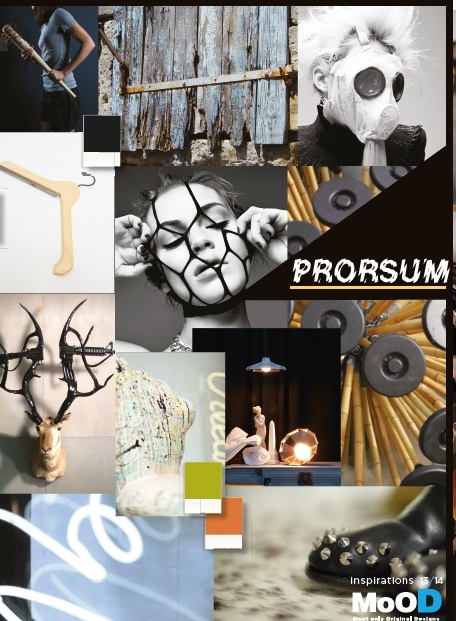
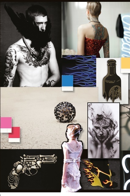
2. PRORSUM
PRORSUM literally means ‘onwards, straightforward, without ceremony’. It’s a ‘go getter attitude’. PRORSUM leaves very little room for doubts. This style originates from the acceptance of society as it is and is seen as a source of inspiration.
Hard colors and a direct visual language are the essence of this urban style that is presented with great sense of humor and even satire. This trend has a sense of masculinity, but in it’s female form, PRORSUM is tempered with pink, blue and yellow.
The color palette:
PRORSUM means a powerful, direct and urban palette. In this theme everything revolves around expression. PRORSUM is a statement, a life style that asks for a daring effect of the combined colors and risky hues. When used independently, the colors appear aggressive and solo. They do not let themselves be influenced by what surrounds them. When placed with another color it seems they enter into a duel. The colors of PRORSUM turn every object into a statement: here I am, this is where I’ll stay.
A clean black is omnipresent but is generally accompanied by a burning orange or bright blue. Stiff yellow and pink run through this palette and temper the aggression somewhat.

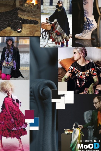
3. ECCENTRICS
Eccentrics is inspired by hyper individualism and the sublimation of the eccentric life style. Eccentric people catch the imagination of people today more than ever. Style icons like Oscar Wilde, Vivienne Westwood, Björk or Iris Apfel (93 years of age!) keep a grip on our mind. Somewhere deep down we all want to be a little eccentric, even if our great examples are bipolar, narcisstic, arrogant or only moderately talented. Eccentrics is a trend theme that transcends generations and which has been designed and purified to the last detail. Everything is made, up to the smallest detail, often on the verge of kitsch, but without lapsing into it.
The basis of this trend is classic with a timeless sense of ‘being special’. Glamour and expensive materials, preferably available in limited quantities, flourish sumptuously here.

The color palette:
Wealth everywhere, but not for everybody, this is the spirit of a somewhat lush color palette. These deep round colors provide everything with a royal sophisticated elegance. Everything is put on a throne. Gold, silver, copper and black are statements that exude power, but also intrusively push from the background. In this palette red gets an unseen depth and is shrouded in a dark mist. Purple on the contrary attains its full glory by staying honest and natural. Turquoise is both deep and intense and combined with gold it’s a winner in this rich palette. White is a newcomer which lifts the palette into a new world.
See how the MoOD trend Board brings these trends to life September 11-14, 2012 in Brussels.


