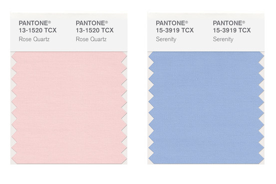
The Pantone Color of the Year 2016 is… Wait for it… not one but two colors -Rose Quartz and Serenity, or for me, Pale Pink and Baby Blue. I feel like I am at a baby gender reveal and it’s twins. But according to Leatrice Eiseman, Pantone’s executive director, says that’s not the case. “Rose quartz is not baby pink,” It doesn’t have that wimpy feel.” Pantone sees this year’s colors is also seen as a natural pairing so it made sense to release not one but two colors.

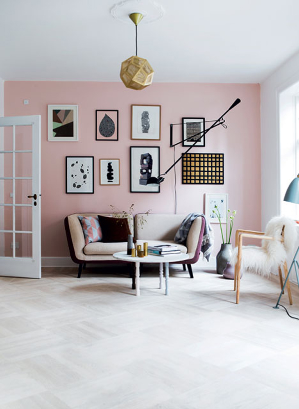
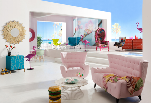
“From a business perspective, its two colors, so it’s an opportunity to make extra combinations,” says Ms. Eiseman. “It makes for a perfect combination in the home” for tablecloths, glassware and ceramics. She predicts paisleys and plaids will make use of the combo.


Pantone describes the colors as “inducing feelings of stability, constancy, comfort and relaxation,” arguing that they “create balance in a chaotic world and will resonate with today’s consumer. This is a 180 degree change from recent years; where the color of the year choices were much bolder that lead to more visual pop and sizzle for interiors. Balance and calm aside, is the choice of two colors a reflection of the duality in consumer behavior?

15 Years of Colors
Will your customers embrace the pastel trend? (We’ve certainly saw it on the runways recently.)
Do these colors signify a shift toward escapism? What do you think?
Room Images via Imperfect Polish and Kare
Pastel Sampleboard via Trend Bible
Color images via Pantone


