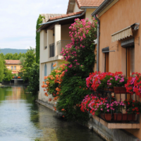
Ta Ta Turquoise, Hello Honeysuckle!
“Courageous. Confident. Vital. A brave new color, for a brave new world. Let the bold spirit of Honeysuckle infuse you, lift you and carry you through the year. It’s a color for every day – with nothing “everyday” about it .”
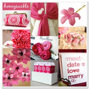
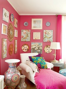
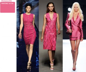
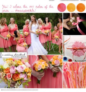
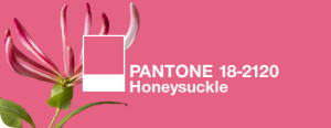
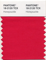
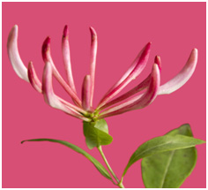
That is how Pantone describes it’s 2011 color of the year . A dynamic reddish pink, Honeysuckle is encouraging and uplifting. It elevates our mood, instilling the confidence, courage and spirit to meet the exhaustive challenges that have become part of everyday life. It’s a color that makes Dorothy Draper proud.
“In times of stress, we need something to lift our spirits. Honeysuckle is a captivating, stimulating color that gets the adrenaline going – perfect to ward off the blues,” explains Leatrice Eiseman, executive director of the Pantone Color Institute®. “Honeysuckle derives its positive qualities from a powerful bond to its mother color red, the most physical, viscerally alive hue in the spectrum.”
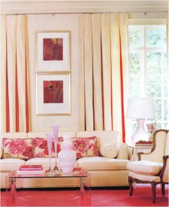
Expect to see the rosy shade pop up on everything next year from dresses to appliances. Last year, turquoise was supposed to bring calm and serenity to our troubled world. So moving forward, hopefully thinking pink will improve the economic outlook for the new year. By the way, what’s that color therapists say about pink?
