Pantone recently released their 2014 home color predictions at The International Home and Housewares show in Chicago. The Style and Substance Pantone color forecast has something for everyone. There are no less than 9 color directions and 73+ colors, no matter what your style is you have to find something that appeals to you. Actually I am wondering is it isn’t a bit of overkill, sometimes it easier to pick veryting you like rather than edit or curate the best. Take a look at the nine trends and let me know what you think.
“Consumers are becoming increasingly color savvy and color aware, said Leatrice Eiseman , executive director of the Pantone Color Institute®. To successfully entice them, colors and color combinations must be appealing, evocative, transformative and most importantly, on-target.”
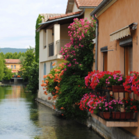
Techno Color recognizes technology, its advances, the speed at which it is advancing and how it is impacting the world of design. Technology is expanding the color universe through a melding of both vibrant and deep hues frequently executed in reflective surfaces. Shades like faceted Emerald and a turquoise-like blue, an exuberant orange and a strong, vital purple plus a true blue, Jet Black and Dark Citron are intertwined in intriguingly inventive color combinations.
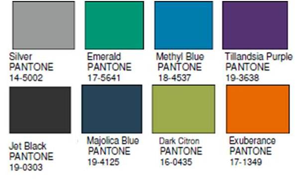
Physicality speaks to the colors of power and energy counterbalanced by the presence of hues that express the necessity for introspection and calmness. Forged iron, satellite gray, antique moss and gothic olive, strong, solid colors, are interplayed with the healing shades of herbal lavender, grayed grape, rosy brown and a quiet, ephemeral foggy gray.
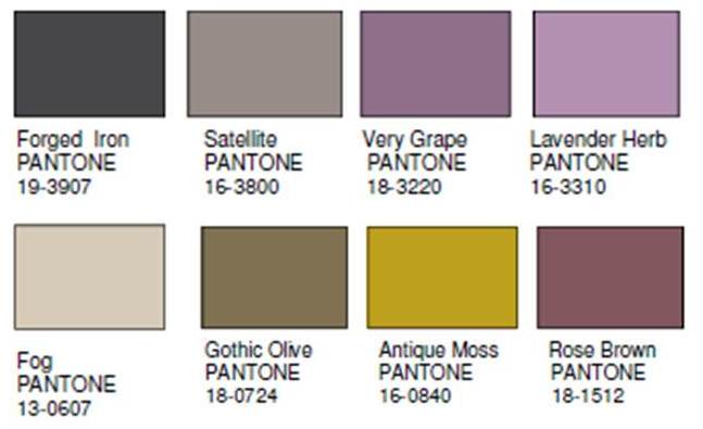
Sculpted Simplicity speaks to how important shape, form and structure are to the end product and/or environment. The colors are unassuming and do not take center stage. The sophisticated tones elegantly harmonize with distinctively nuanced undertones, and include travertine, anthracite, blanc de blanc and twilight mauve, supported by an anodized brown, ethereal gray and a suggestion of silver.
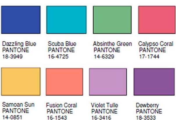
Fluidity is the palette that understands the inevitable human need for life-sustaining cool water tones, and is rendered largely in dazzling blues and blue-greens. These cooling hues include absinthe green, violet tulle, blazing Samoan sun, dewberry purple and two orange-coral tones.
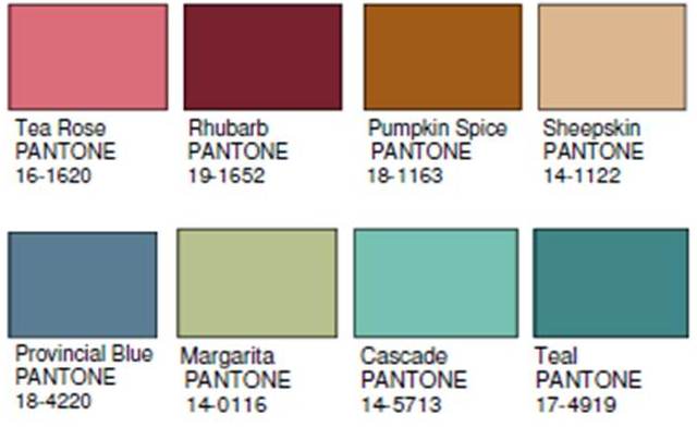
Collage is about the home being a gathering place for found objects that are well worn and somewhat nostalgic – a charming mélange of artfully constructed designs that demonstrate ingenuity and resourcefulness. There is poignancy in this palette with color and design sounding a familiar chord. Tea rose, deep reddish rhubarb, warm pumpkin spice and cozy sheepskin, are refreshed with margarita green, provincial blue and cascading tones of aqua and teal make up this grouping.
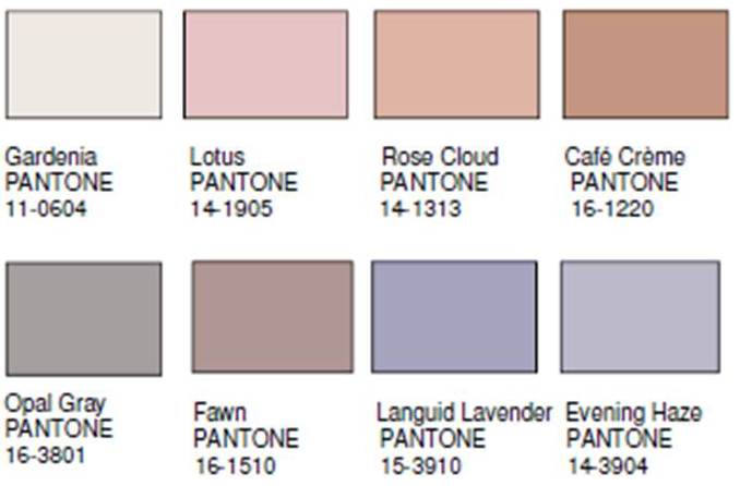
Intimacy implies a certain affinity and relationship expressed in tints and tones that are inviting in nature and softly tactile – closely connected, yet subtly different, a happy marriage of adaptable warm, cool and neutral tones. The palette includes gardenia white, lotus blossom pink, rose cloud, fawn and café crème, while pale lavenders and opal gray.
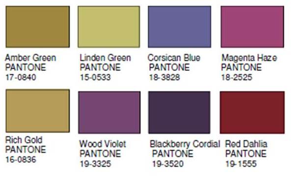
Both svelte and voluptuous, Moda speaks of attention to detail and the drama of high fashion when translated into interiors. Combinations can be theatrical in nature, displaying fashionable or whimsical flourishes, but always done with tasteful finesse. Red dahlia interacts with blackberry cordial and wood violet, all accented by a yellowed amber green. Corsican blue meets with magenta haze and an expressive linden green, while rich gold waits in the wings for the appropriate moment to add a glimmering finale to any of the combinations.”
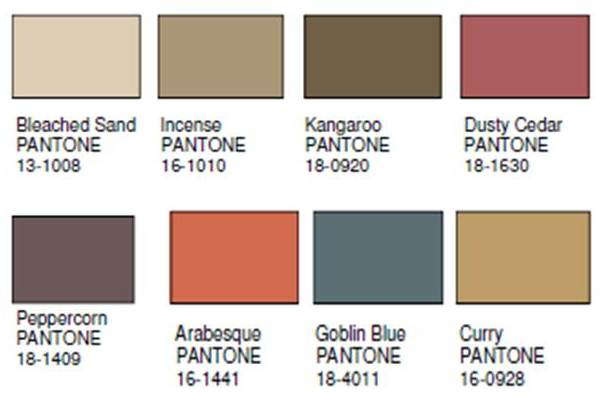
We are all members of tribes whether through cultural background, religion, political affiliation or community. Tribal Threads color palette is as varied as the tribal diversity it represents, yet they construct a universal linkage of artistic appreciation rooted in personal expression. Color combinations may be disarmingly simple or as complex as inter-woven threads. Included are neutrals, such as bleached sand and kangaroo brown, burnt orange, goblin blue, curry, peppercorn, and a rose-dusted cedar shade.
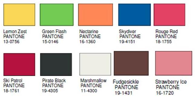
Eccentricities is tongue-in-cheek in attitude with color juxtapositions that are highly original and cleverly conceived in evocative combinations. A flash of neon green radiates off of zesty lemon or nectarine combines with a daredevil Skydiver blue. Fudgesickle brown is rendered sweeter with Strawberry Ice. A warm red coexists with its cooler counterpart, while black and/or white can be drawn into any combination,