Color is the catalyst that can spark the sale, define the space and create the magic and the mood
Pantone released their home color trend palettes for 2015 consisting of nine key palettes under the umbrella of New Harmonies: Changing Themes in Color/ Design Trends. The nine palettes for 2015 are:
Style-Setting:
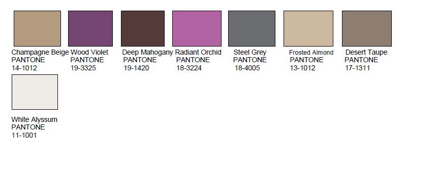
Using Fashion as inspiration for color, materials and in the home, this taste-making palette is about polish, poise and finesse.The purple color family plays off against mahogany, off-white, gray and taupe, and picks up some shimmer with frosted almond and champagne beige.
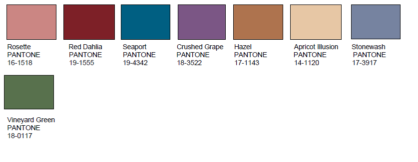
Abstractions: Abstractions releases the artist in all of us. Like abstract art, the groupings in interior spaces will seem randomly gathered creating a mosaic of shapes and colors with a focus on geometrics. Color pairings including grape and apricot, dahlia red, stonewashed blue, hazel nut brown and vineyard green that might at first seem haphazard or arbitrary when put together make perfect sense.
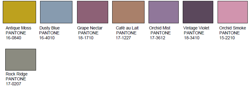
Botanicum: Lifted directly from flora and fauna, this color story is a sophisticated grouping of natural hues, including shadings of green, grape and café au lait, often counter-balanced with dusty or smoky tones of blue and orchid creating the perfectly balanced natural palette.
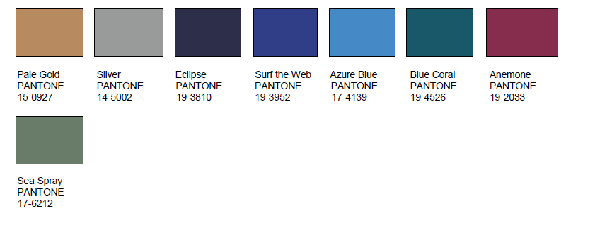
Zensations: Zensations literally is about heightening and engaging the senses by taking the calming blue, blue-green color family to another level by injecting a dramatic red, atmospheric green and sparkling metallics.
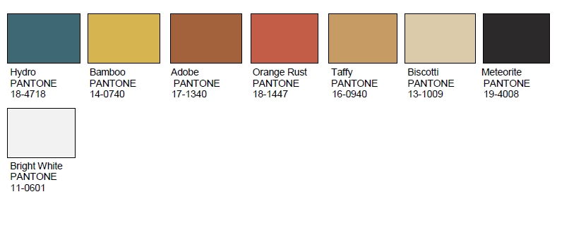
Urban Jungle: This palette tames the rustic color stories smoothing out rough textures into sleek contours and by combining both typical and atypical hues. Warm animal skin tones are set against with deep teal blue-greens, a vibrant citron yellow, plus black and white.
Tinted Medley: The harmonious medley of closely related, warm tones of peach and pink like Bellini, apricot wash, peach amber and macadamia are underscored by roses and yellows as well as a rosy-taupe.

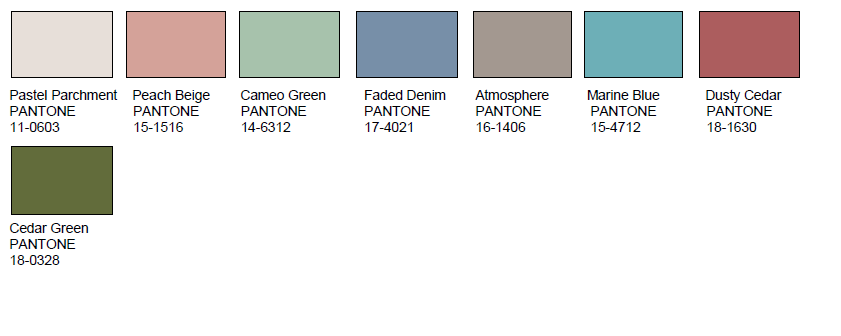
Past Traces: Past Traces honors the history in the home. We all find the vestiges of the past satisfying and deeply comforting. Gently worn shades such as pastel parchment, cameo green, faded denim and dusty cedar capture the memory and while still feeling modern.
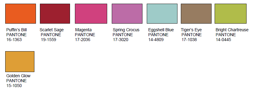
Serendipity: Serendipty means pleasant surprise or happy accident and this palette reflects just that. A jumble of “unlikely designs and unexpected colors,” including orange and eggshell blue, bright chartreuse and yellow gold, hot pink and scarlet – with tiger’s eye taupe as a neutral.
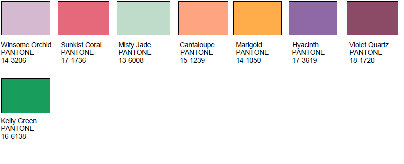
Spontaneity: Spontaneity brings on the FUN. This palette spurs the impulse buy, the spur of the moment design decision through upbeat hues of Sunkist coral, marigold and cantaloupe are complemented by kelly green and grounded by the deep tones of hyacinth, violet quartz.