I tweeted out Jess Cartner -Morley’s article, New York Fashion Week: Eight Trends to Take Home, for the Guardian the other day and then got to thinking how they might be applied to window fashions; especially seeing as the lines between fashion and interiors are almost indistinguishable these days. So here it is:
Guardian- The next big thing: Menswear fabrics
Last season’s big womenswear noise was around a mannish silhouette; for autumn, it’s all about menswear fabrics.

Tommy Hilfiger
On the Window: The proverbial classical gentlemen’s club looks are anything but stodgy. Look for this direction to manifest itself on the window in the form of wool flannels, billiard cloths, pinstripes, aged leather tabs and edges looking like they just came off a chesterfield; Scottish tartans and of course, worsted plaids and checks with houndstooth in all sizes leading the way. Use these fabrics as:
- Solid wools colorblocked with or without plaid insets
- Plaid mashups/ collages mixing glen plaids and checks as a leading edge detail or contrast headings- really twist it up by using smocking tape
- Peek-a- boo stripes and houndstooth contrast linings.
- Leather or contrast tapes on plaids
Guardian- The comeback: Layering
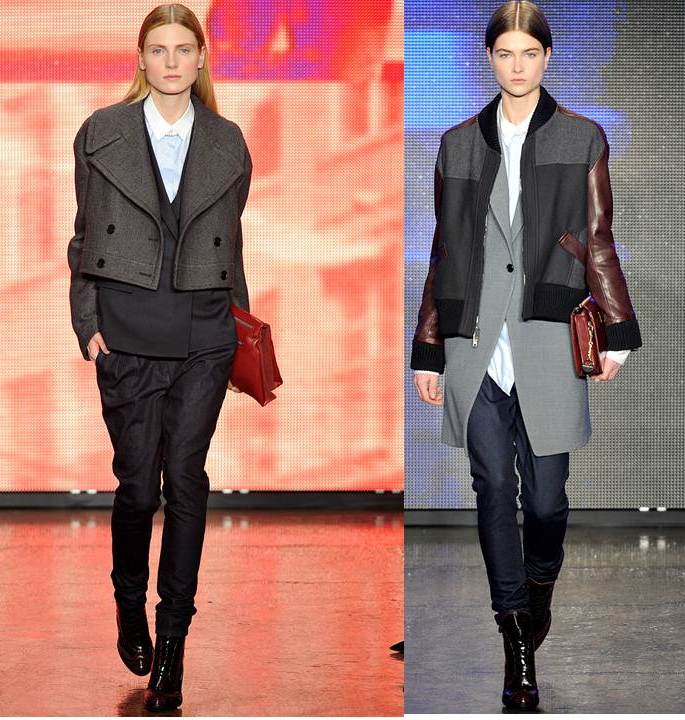
Remember how we were all, “layering’s so over, it’s all about the crisp simple pieces”? Well, scratch that. Your outfit isn’t happening unless there’s a shirt collar and tails poking out at neckline and how about the jacket over the coat look at DKNY?

DKNY
On the Window: A big WOOHOO- we certainly don’t need to flashback to the over- the- top swagged and layered excesses at the window of the 90’s, BUT I am so tired of a pair of stationery panels on a rod at each side of the window- can’t we be a bit more a more imaginative?
- Attached valances
- Sheers underneath
- Peek-a-boo panels
- Modern layered structural details
- Collaged looks..
Guardian-The retro trend: 70s glam
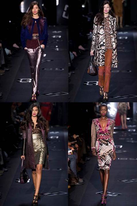
“It’s not about going to a party, it’s about life as a party,” said Diane von Fürstenberg backstage. Who’s going to argue with that? Von Fürstenberg and Marc by Marc Jacobs both reached back to a glorious era of NYC history, the late 70s, to inject some feel good rock’n’roll glamour into the week.

Diane Von Furstenburg
On the Window: “Be the window you want be…” let’s have fun, shake it up, get out of our neutral blind and shade comfort zone and put come glamour on the window. I might finally be able to use that sparkly, fuchsia croc faux leather I have been eyeing in my sample books.
Guardian-The new matchy-matchy: Matchy-matchy-matchy-matchy
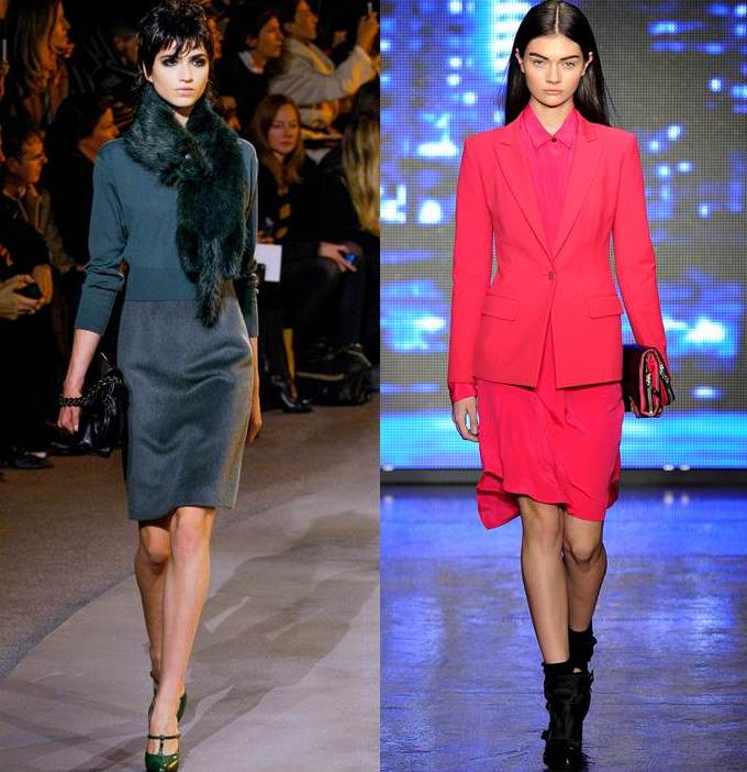
Seriously. At DKNY, a pink-tinged leopard sweater was worn with a skirt, bag and shoes – all in the same print. Fashion is about finding new ways to make matching modern, right now.

Ralph Lauren DKNY
On the Window: we are all about matching- the color, the pattern the walls… the trick here is how do we make it modern. For me I think it’s the subtle difference color take on based on its ground or when the hues ar off just a bit- subtle but sophisticated so its finding the subtle but sophisticated almostbutnotquite match or mixing media satin and wool sateen…
Guardian-The silhouette: The round shoulder
If you change one thing, change this: the sharp shoulder is dead. It doesn’t really matter whether you take the Alexander Wang route (a Paul Poiret, kimono-ish silhouette) or the sportier, DKNY/Victoria Beckham/J Crew raglan sleeve route. What matters is that the shoulder is soft and rounded, not Gaga-sharp. Got it?
On the Window: Interesting- something we don’t often think about in wf world- the silhouette. So maybe we’ll see a return to a softer, rounder edge through rounded corners at the return, French Poels or even bishop sleeves- I confess I have been wondering when they might return.?
Guardian-The name to drop: Thom Browne
He is known for two fashion moments: instigating the cropped-trouser trend as a hipster-menswear motif, and dressing Michelle Obama in a necktie-inspired dress for the inauguration. His show this season confounded those who expected him to use the inauguration as a commercial springboard: all exaggerated silhouettes and theatrics, it was bonkers and utterly brilliant.

On the Window- What can I say- making a statement at the window even if it is a bit crazytown will certainly differentiate your personal brand. Plus, for those of us that love windows why wouldn’t we want to make it a focal point ?
Guardian-The new phrase: Madder carmine
I won’t lie, I had to look it up. Turns out, madder carmine is a purplish red. In the parlance of the British school uniform, we know it as burgundy. Burgundy is making an early attempt to oust navy this season, cropping up everywhere.

On the Window – Easy! ( now that I know what it means thanks to Jess) tell your customer Madder carmine is the trendy color for the window- a must have! But make sure you can back it up before you say anything.…
Watch for my upcoming post about top textile takeaways from the European shows.


