Here’s a bullet list my musings and trendspottings of what June 2014 Showtime had to offer and what we’ll be seeing on frames and in sample books in the coming months.
Pattern Rooted in Tradition
- Patterns are firmly embedded in influences from the Past in soft color palettes that don’t feel old or fussy.
- Intricate looks like medallions, scrolls, delicate botanicals, and classic motifs were seen frequently and are inspired by lace and elaborate embroidery elements.
- Jacobean florals along with elaborate Chinoiserie and especially tribal motifs that speak to many global cultures, but remain traditional are on trend.
- Repeats range from smaller scales to huge medallions
- Chinoiserie continues to inspire with motifs like foo dogs, dragons, Chinoiserie toiles.
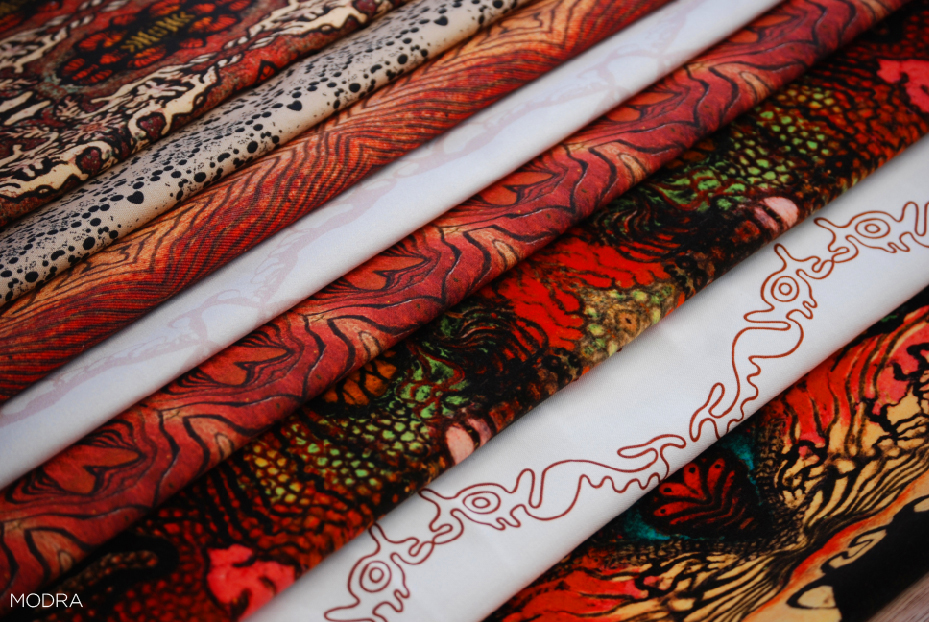
Amazon Collection by Modra
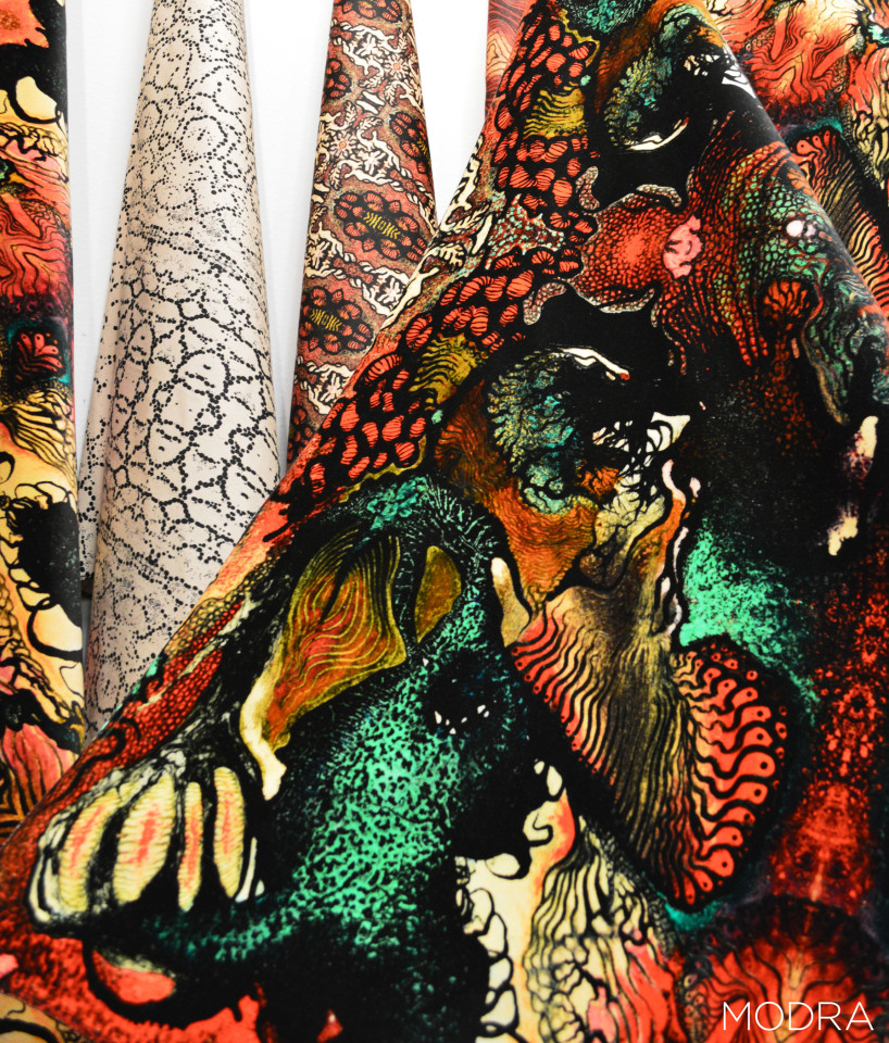
Amazon Collection by Modra

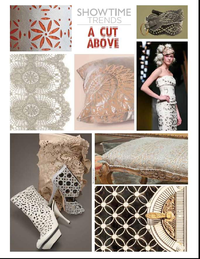
- Laser cut overlays trimmings and stencils
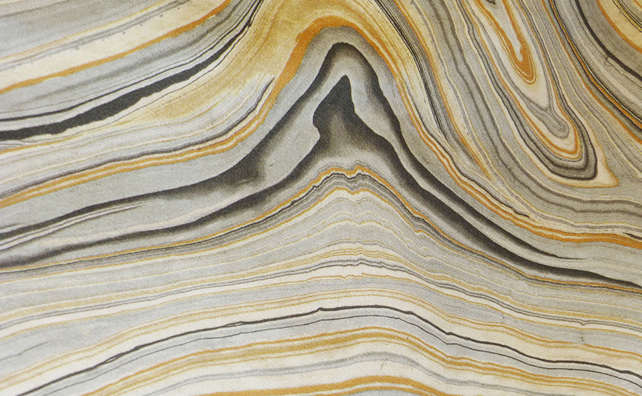
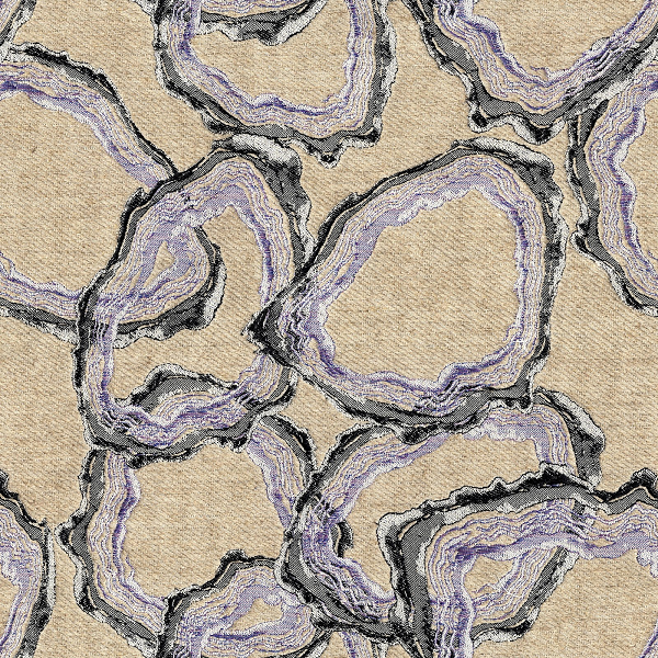
- Geodes and stone looks like marble and malachite
- Put a bird on it- it will sell
- Texture thicker, chunkier with boucle yarns
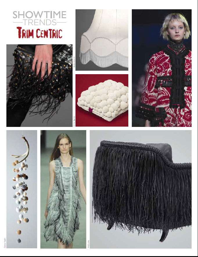
- Trim makes a comeback- Look for fringe to lead the way
Carrarra by Home Fashions
Elizabeth Esry Jacquard winner
Florals continue to be strong with fresh takes on the pattern to help move it up the trend curve. They range from:
– Soft and Romantic to playful
– Digitally Printed
– Blurred Lines, ink spots
– motifs are not as literal
– Bright and bold colorways with geometric elements
– Folkloric Prints, (Russian and Eastern Europe) Embroideries, and Motifs
– Toile making a comeback
Color Makes it Modern
Vibrant color used to enhance classic style. Overall vibrant color punctuated traditional designs.
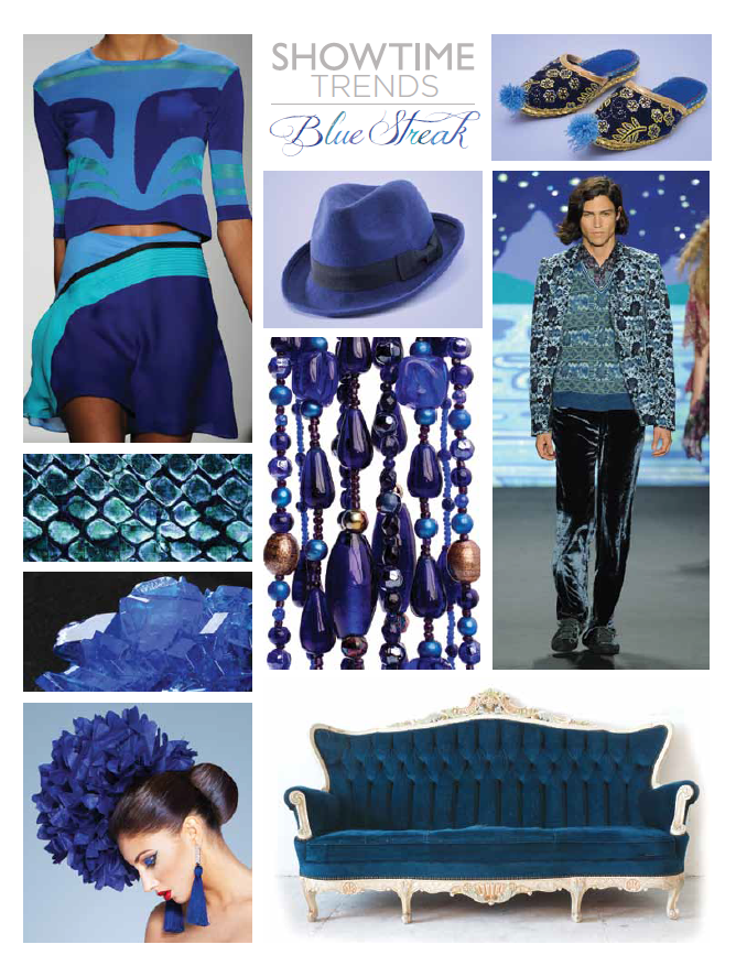
– Variations of blues still strong with a shift to turquoises with names like Capri and Mist. Blues are brighter and moving away from indigos we have seen in past year. Signaling muted, more relaxed palettes now that the economy is picking up.
– Everything is coming up Rosy. Pinks are hot from subtle romantics to electric shades of fuchsia and magenta
– Purples and purple undertones play off Pantone color of the year- Radiant Orchid
– Start selling color if you haven’t; the end is not near- Fall 2015/ 16 forecasts say color is still very important with more of a fusion of color- the mixing of warm palettes into one color story. Not Pop of Color or an explosion of one color, but an explosion of every color in every range.