
Everyday Extraordinary Provence
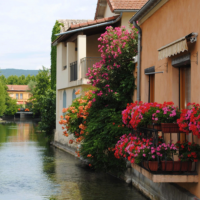
Join us in September 12 – 19, 2020 for a Textiles and Design trip-of-a-lifetime!

Join us in September 12 – 19, 2020 for a Textiles and Design trip-of-a-lifetime!


Copyright © 2016 Design Confidential. Site design by Hibiscus Creative on Thesis.